Motherhood and Longevity
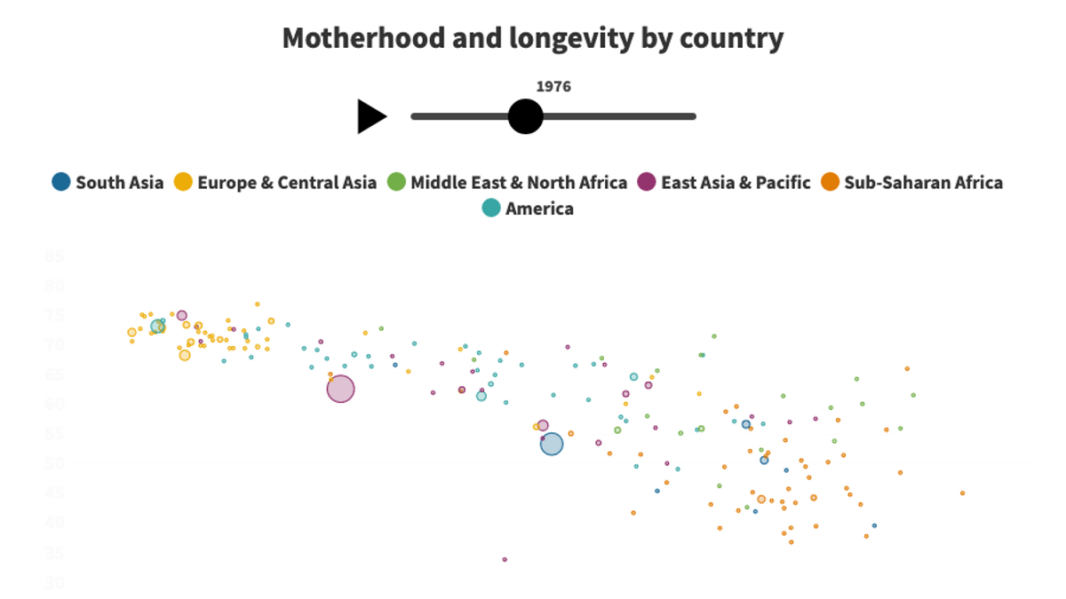
I used data from Gapminder to create an animated visualization comparing the number of children per woman vs. life expectancy by country and continent over time. Each point represents a country within a continent.
I used data from Gapminder to create an animated visualization comparing the number of children per woman vs. life expectancy by country and continent over time. Each point represents a country within a continent.
